
The project was presented as part of the Re|creación 26 exhibitions.
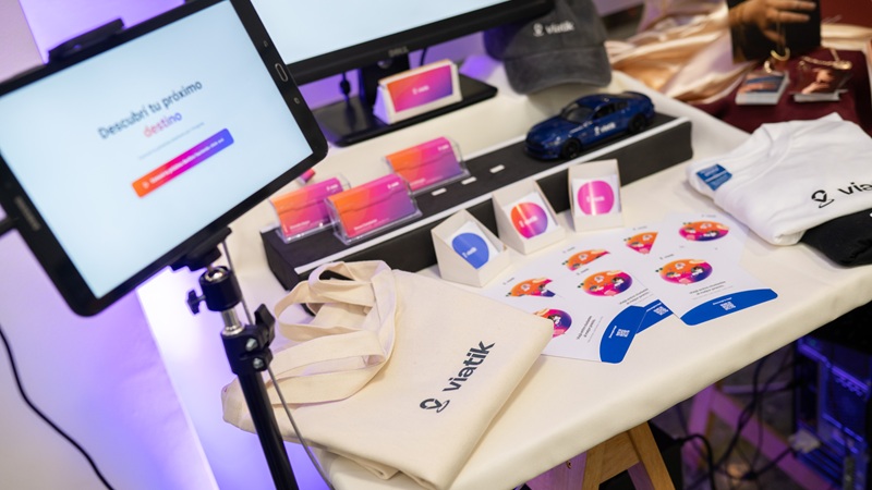
Products created for Viatik
Selecting Viatik for the Integrative Project involved addressing multiple areas: a visual overhaul, product improvements, and the development of new offerings.
One of his projects involved redesigning Viatik’s app and website froma UI/UXperspective, creating a more minimalist and intuitive interface. In terms of user experience, the steps involved in business processes—such as booking trips—were streamlined and simplified.
It also created a Design System featuring reusable rules, components, and styles, with the aim of ensuring visual consistency, scalability, and development efficiency. This was applied to both the brand communications and the website and app.
He also proposed publishing more content (posts and stories) with a fresh, more cohesive visual identity, while reducing the reliance on paid influencers.
It also launched a loyalty program—a strategic initiative featuring an incentive system for drivers and passengers designed to encourage the use of Viatik's services.
In short, rather than creating isolated components, he built aconnected ecosystem that took into account visual identity, user experience, and content strategy—approaching each solution as a coherent and scalable system, rather than as standalone solutions.
The research process and user needs
Although the Capstone Project course is offered every August, Santiago began thinking about which company to work with back in March, and after choosing Viatik, he conducted a thorough investigation of the company.
This involved analyzing the mobility market of which Viatik is a part, examining the app and the users of the service, as well as conducting interviews and surveys. It also involved using the service myself and taking a trip with the app from Montevideo to Punta del Este:
I had never used Viatik before, and with this project I needed to try it out for myself to see what kind of requests or pain points users have.
From the moment he booked the trip until the end of the journey—which involved the driver as well as other passengers—Santiago noted down the suggestions he received and the areas he observed that needed improvement.
Another of his research methods was purchasing a Design System course to learn how to develop and implement it in his final thesis project.
The multimedia design student identified several areas in need of improvement. Visually, the brand identity was not aligned with its target audience and needed a "fresher" design that was in line with current design trends.
From a user-centered perspective, while the user experience was adequate, it needed an update aimed at creating a more minimalist and intuitive interface.
Finally, while Viatik’s social media accounts showed some activity, their strategy was limited, focusing mainly on collaborations with influencers and offering little variety in content.
Visual identity and color palette
The visual identity proposed by the designer was characterized by a minimalist, modern, and trustworthy design. Minimalist, in that the design reduces visual clutter, makes it easier to understand, and uses a limited color palette. Modern means that it was adapted to current design trends.
These two aspects were reflected in the project’s color palette. The dominant color was orange, accompanied by white as an accent color. The former was a color that the owners of Viatik—Gonzalo Aszyn, Renzo Battaglia, and Renzo Constanzo—had been working with from the very beginning and held in high regard, a point they emphasized to Santiago when he began working with the company.
However, Santiago added shades of purple and pink, as well as other secondary colors, to bring a sense of freshness to the design. Despite the variety of colors, the designer maintained a minimalist aesthetic through the use of gradients:
(gradients) are really trending right now, and they’re often associated with companies or startups. I used a gradient that’s quite clean and linear to create a sense of order through integrated colors that blend into one another. It’s meant to convey a sense of calm without losing the essence of the design.
Finally, the concept of reliability aims to build trust so that potential users will be encouraged to use the app:
Trustworthiness was one of the key areas I wanted to address. In my research, I had noticed that people felt a certain degree of mistrust when taking that first step to use the app, so one of the fundamental issues I wanted to tackle was the matter of trust.