
With the aim of encouraging designers to embrace this uncertain moment for the great potential it holds, to allow themselves to feel the discomfort of the unknown, and to open themselves up to renewal and growth, the International Council of Design (ICoD) announced that “Suspended in Transition” is the theme for the 2022 edition of International Graphic Design Day, marking another anniversary of the council’s founding.
On this new occasion to recognize the value of design and its ability to bring about change, Vicente Lamónaca emphasizes that what matters is“understanding graphic design as a discipline that is more social and humanistic than technical.”
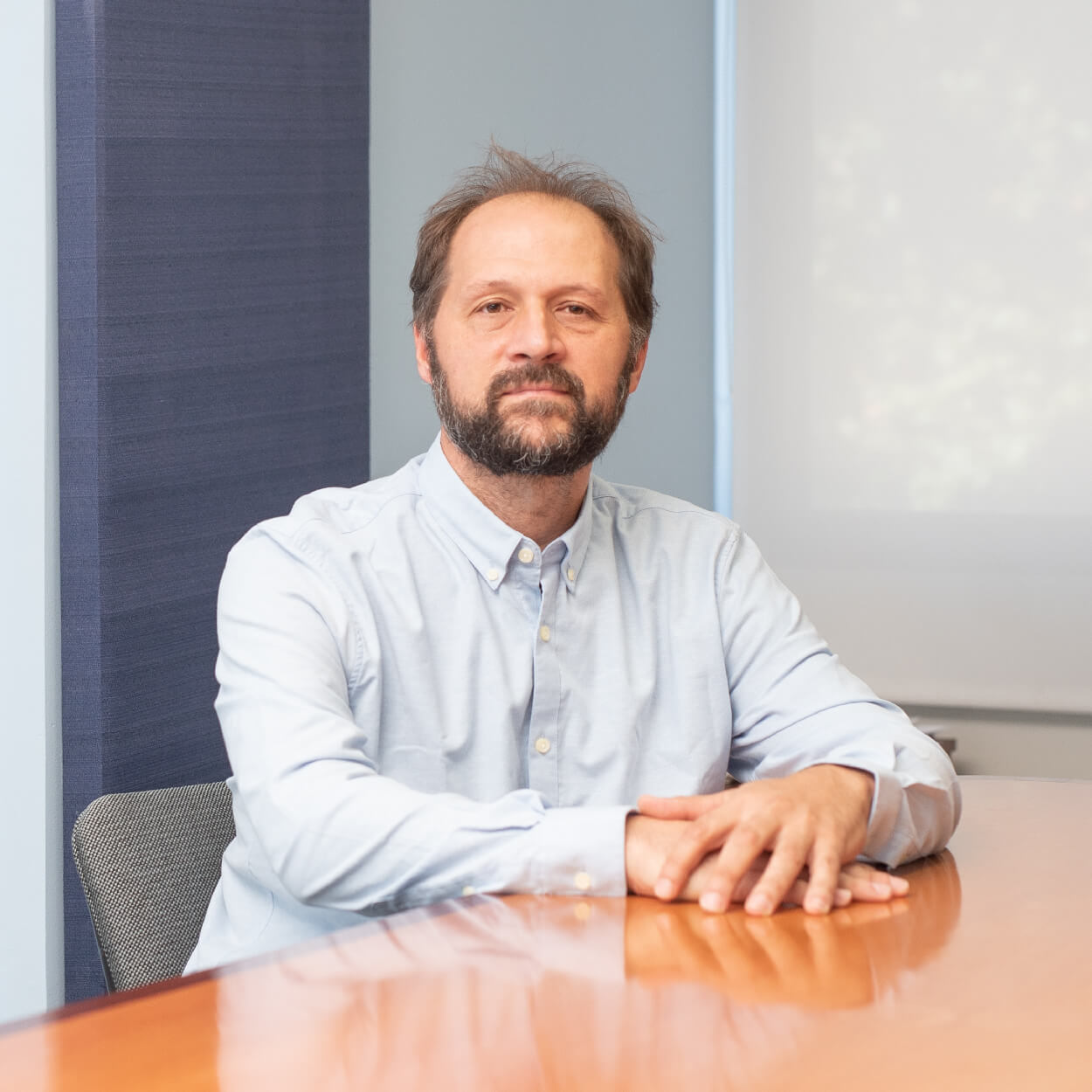
Lamónaca has served as the academic coordinator of the Bachelor’s Degree in Graphic Design at our School of Communication and Design since March 2022; he has been a faculty member at the School of Design for over 20 years and is among the first generations of students and graduates in graphic design at the university. ORT’s graphic design program was the first of its kind in Uruguay; it began in 1994 and became a bachelor’s degree program in 1996.
“Once we understand that design can be functional, solve problems, and encourage people to consume, think, and express their opinions more effectively, it will become more relevant to society. As designers, we have a responsibility to define our profession in the terms in which we want it to be valued.”
Suspended during the transition
“Being both ‘suspended’ and ‘in transition’ can cause anxiety but also, potentially, growth,” says the ICoD in introducing this theme, which they describe as a border zone between things, filled with contradictions and uncertainties; and being suspended in that transition may be the best way to remain open to the opportunities that lie ahead. Likewise, it requires designers to step outside their comfort zone and embrace partial knowledge, non-definition, and non-design, in order to reflect from a place of discomfort and flow at the same time.
For Lamónaca, based on the notion that design responds to society—which is itself dynamic—one cannot expect that all future situations can be explained under the same premises in order to arrive at a universal conception of design. Design, he argues, “must respond to specific contexts of time, place, and culture, and the globalized nature of the world does not allow us to take into account the countless possible contexts that exist. That is why design, almost by definition, should always be in a state of transition. We must always be clear about where we are, what we need, and where we want to go, day by day.”
Fonts
Why design typefaces?
Typography is a core element of graphic design. Everyone who writes uses typography, but no other discipline applies it as specifically. Within graphic design, editorial design examines certain aspects of typography in greater detail.
One day, in order to solve a specific typography problem, I created my own typeface to fit the exact dimensions and proportions I needed. That’s how my own type design studio, TipoType, came to be—and it’s still going strong today.
What are the key characteristics of typography?
 There are three main levels. The first is the aesthetic aspect, which determines whether I want the font to look formal and serious—because it’s for an official statement—or to resemble a child’s handwriting. The second level is the technical component: some fonts were created for a specific purpose. Times New Roman, for example, was designed for the British newspaper The Times: intended for daily printing, small size, lots of text, to be read from 40 centimeters away. That doesn’t mean it won’t work for anything else, but instead of using it on a highway sign—which has few words, is viewed from a distance, and where visibility might be impaired by rain, low light, glare, or movement—you can use other typefaces that were designed and tested specifically for that purpose.
And the final step depends on what you need to write, because not all typefaces include special characters. When you tell someone you’re going to create a new typeface, they usually think of a font full of symbols and odd characters, but that’s not the case. Often we need an existing font to have a missing accent, or to be adapted for writing recipes or chemical formulas, because there are specific uses that require specific symbols.
What is the challenge of creating a new typeface, given the vast number of existing designs?
If we think in terms of shape, it’s difficult because there are literally 150,000 fonts—everything’s already been done. Plus, the letter has to look like an “a” so it reads as an “a,” so you don’t have much leeway there either. But when you look closely, you realize that for certain projects you need, for example, quotation marks that don’t get in the way of reading too much. Generally, it’s not that you create a bizarre typeface, but rather that it will be similar to all the others yet has a combination of proportions and characters that work for specific tools, devices, or formats.
What is the typeface design process like?
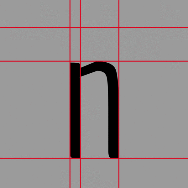 It's a very methodical and step-by-step process. You don't start in alphabetical order; instead, you start with a few letters that serve as a guide for the others. For example, if you're drawing the letter n, you indirectly did the h, the u and the m. I have the vertical line connected to an arc; I need the diagonal: can you draw a v. There, indirectly, you already have the w, the k, the x. It involves a lot of geometry and precision, but also a great deal of perception and what we call optical adjustments: if you draw a square and a circle of the same height, they look different—the square will always appear larger. So you enlarge it until it looks right to you.
Design, Communication, and Society
How do you communicate through graphic design?
As a designer, your goal is to achieve specific outcomes. If you’re creating a campaign for a referendum, your goal is for that option to win; if you’re designing a poster for a theater, the goal is to get people to go to the theater. Design has a specific, functional communicative purpose. If we understand it as a human discipline, the key is empathy with the audience; I need to be interested in the type of people I’m targeting to define the message I want to convey. As a designer, if you focus on the color or format that’s in vogue, you lose the entire human element. My opinion is that you always have to keep in mind that you’re working to engage another person.
How do trends influence graphic design?
The short answer would be: poorly. I can tailor my message to fit a trend so that the audience perceives it as new and fresh, but it must also achieve its objective—it needs to have that human element. Trends can serve as a vehicle for greater impact, but they remain the most superficial aspect of design.
Why has graphic design become increasingly important?
Its importance is increasingly understood and accepted, although we are still far from giving it the recognition that we designers believe it deserves. When I first started studying design, my parents had no idea what it was all about. Today, graphic design is much more established; people have a general understanding of it. It’s a field that has been producing graphic design graduates for over 20 years in Uruguay and here at ORT.
What is the relationship between graphic design and new technologies such as the metaverse and NFTs?
New technologies and devices are shaping the practice of design as it incorporates them. This gave rise to new disciplines such as multimedia design, which has its roots in graphic design but grew so much and became so broad that it evolved into a new and distinct discipline. I’m not sure if these technologies influence design; rather, design adapts to the technologies and devices that emerge, because I believe the concept of design is more enduring than technological changes.