Students from the Identity Design 3 of the Bachelor’s Degree in Graphic Design, staff and officials from the School of Design, as well as representatives from Fedrigoni self-adhesive papers and the DMR printing company.

This award ceremony was held as part of an annual event organized by the Bachelor of Graphic Design and the short-term program in Graphic Design, in collaboration with companies where students take on the challenge of designing a label for products seeking to update their visual identity.
Opening of the ceremony
The event was opened by Oscar Aguirre, the dean of the school, who, on behalf of the university, welcomed the students, faculty, staff, and company representatives who supported the development process.
First, he thanked the students for the high quality of their work and teachers Andrea Montedónico and Agustina Grau for guiding the students through the label design process.
We also extended our thanks to Gerardo Turnes, general manager of the DMR printing company; Guzmán Gazolo, sales representative for Fedrigoni self-adhesive papers in Uruguay; and Camila Bertolani, account executive for Latin America at the same company.
Also noteworthy was the support provided by Bodega Rosés through the ongoing assistance ofFiorella and Martín Rosés, who work in the winery’s Oenology and Marketing departments, respectively.
The dean emphasized the cultural value of the work done in class, noting that it goes beyond label design:
What we are seeing today is much more than that. It is the building of culture, the building of memory, and the building of identity.
With enthusiasm and pride, Aguirre concluded his remarks by highlighting the quality of the projects presented: “What I’m seeing out there is history—or will become history—because it is culture and because it is good design.”
The design process behind the labels
Andrea Montedónico was the next to speak, beginning by explaining the students’ process in designing the labels, from the initial sketches to the final graphic designs applied to actual products:
“It’s very exciting to see this project come to fruition, the result of the students’ hard work. We’re so proud to see how those ideas evolved from the initial concept to their final visual form.”
He also explained how the students worked with the winery to explore the meaning behind the name of their new wine line—inspired by a Bach flower associated with intuition—in order to propose visually meaningful concepts.
Of all the proposals submitted, four were selected by a jury composed of representatives from the participating companies and the Design faculty.
In addition to the new projects, the labels created for Bodegas Rosés are on display in the Design School lobby, alongside works from previous years.
The exhibition, titled Real Media, Visual Concepts, will be on view from April 21 through May 2 and also features designs created for Cerveza Porco Negro, Vinos Homenaje, and other brands, reflecting the students’ creative diversity. This event offers a glimpse into the evolving relationship between academia, the graphic design industry, and real-world clients.
“It is essential that students work with professional-grade materials and technology, because that raises the standard of their work and shows them the true scope of their education,” the teacher said.
1st prize: Karen Wilenski and Ronit Laufer
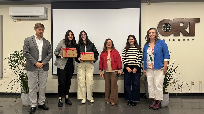
The first-prize winners received a tablet and a trip to São Paulo to attend theFlexo & Labels 2026 trade show and visit the Arconvert factory, owned by Fedrigoni.
The jury highlighted the project’s design approach, which aims to position the brand among a young audience that is just beginning to drink wine.
By studying the strains, the students developed a palette of textures that appealed to the consumer’s intuition and inner wisdom. The proposal included a geometric typographic logo that conveys personality and innovation, featuring prominent use of the letter C as an expressive element. The visual identity was complemented by a vibrant color palette that reinforced the design’s objectives.
2nd prize: Valentina López, Sofía Lasida, and Lucía Fuentes
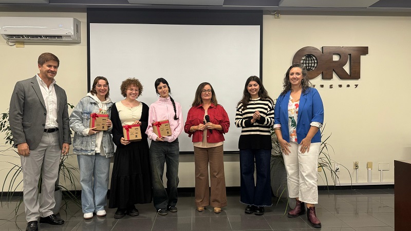
The second-place winners each received a thermal transfer pen.
The jury recognized the high standard achieved in the transition from concept to final identity design.
The key concepts focused on the connection between introspection and self-confidence, represented through layers and with hands as the central symbol. The customization of the labels in a groundbreaking design, combined with a well-defined color and texture palette, gave Cerato its unique personality.
Learn more about theBachelor of Graphic Design program at the