
Graduates Fernando Díaz and Matías Di Ioriohave been key players in this growth through their studio,Reset Type, where they have developed typefaces for the renowned design firmPentagramthroughout 2025.Avril Ponce de León and Camila Gómez, graduates of the same program, also participated in these projects.
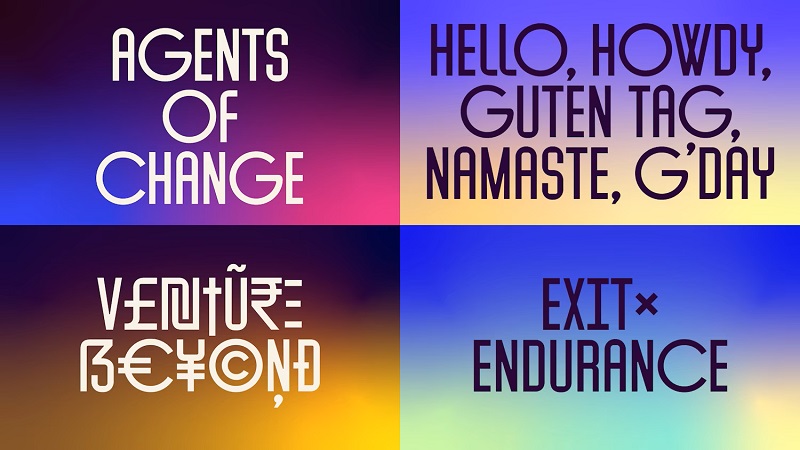
Among the projects developed isCatalyst Sans, a typeface designed for the global venture capital firm General Catalyst, which invests in technology companies with a positive social impact, from the early stages through to the growth stage.
They also designed theMacroSans typeface, created for theMacroFactor mobile app, a platform focused on nutritional tracking and achieving fitness goals.
In addition to these works isFrequency Serif, a typographic project created for theSt. Louis Symphony Orchestra, based in the cityof the same name in the state of Missouri (United States).
Pentagramis an independent design studio considered one of the most influential and renowned in the world.
It develops comprehensive projects for businesses, ranging from visual identity and strategy to product development, digital experiences, and communication systems, integrating disciplines such as graphic design, digital art, and data visualization.
Founded in 1972, the company has in London, New York, Austin, and Berlin, and has developed projects for global brands such asMastercard, Nike, and Tiffany & Co., among many others.
Reset Type: A Pioneering Study in Digital Typography
The type foundry was founded by Díaz in 2022, following an extensive career atTipoType, a type design studio that he co-founded in 2008 with Vicente Lamónacaand Martín Sommaruga, both graphic design graduates.
- You might be interested in:Typefaces designed by ORT graduates are gaining international recognition
Originally conceived as a solo venture, Reset Type grew and brought Matías Di Iorio on board as a partner. By 2023, the studio had become a four-person team, consisting of Díaz and Di Iorio, along with Ponce de León and Gómez.
Since then, the studio has combined typographic design and graphic design, working for top-tier international clients such as Google, Porto Rocha, Wildish & Co, RIISE, and Pentagram.
Typefaces: From Reset Type to Pentagram
The connection with Pentagram dates back to 2020 and came about through the efforts of Diego Prestes, a graduate of the Bachelor of Graphic Design program and current member of the Atolón de Mororoa studio, who was at the time interning at Pentagram in the United States, where he worked alongside Natasha Jen, a partner at the firm.
Years later, with Reset Type already up and running, Díaz reconnected with Pentagram following a visit by Jen to Uruguay to give a talk. Although Díaz was in New York at the time, they communicated remotely, which allowed them to reestablish their professional relationship.
Upon learning about Reset Type’s new studio and its comprehensive approach to type design, a sustained collaboration began between Pentagram and the Uruguayan firm, resulting in the completion of three type design projects and a fourth currently in progress, deepening a professional relationship that Díaz describes as particularly enriching and stimulating.
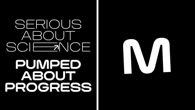
We love working with them because they take a more holistic approach to design: they collaborate with illustrators, typographers, and editorial designers. They’re the ones calling the shots, and they have the ability to reach major clients—something that’s harder for us to achieve.
The creative process, letter by letter
While the international studio focuses on overall identity—including branding, illustration, and digital environments—the Uruguayan studio serves as the“typographic arm”of the projects they are commissioned for.
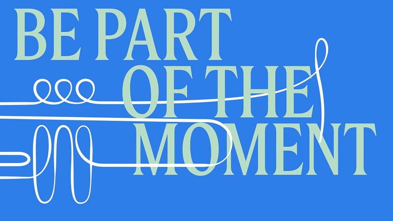
The starting point is a preliminary conceptual idea defined by Pentagram, based either on one or more initial letters or on a visual concept derived from the brand identity. Building on that foundation, the Uruguayan studio’s task is to develop, expand, and systematize the entire alphabet.
The typographic design is a collaborative effort by Díaz, Di Iorio, and Ponce de León, who strategically divide the character sets—such as uppercase letters, lowercase letters, numbers, and condensed or expanded versions—and then harmonize formal criteria, optical adjustments, and visual rhythms.
For his part, Gómez is responsible for graphic design and application environments.
This approach allows us to tackle large-scale projects with tight deadlines while maintaining a high level of artisanal precision. Each typeface may involve the design of hundreds of characters per variant—including diacritics, numerals, and technical or currency symbols—and this number can multiply depending on the number of weights and widths required.
The inspiration for each typeface stems directly from the identity concept of each project. In the case of General Catalyst, the typeface was inspired by the wolf symbol, combining circular shapes with condensed structures to convey confidence, dynamism, and modernity.
Meanwhile, the typeface created for MacroFactor focused on conveying movement, energy, and physical activity, with multiple variations in width and weight.
For the San Luis Symphony Orchestra, the typographic design drew on historical elements from the façade of Powell Hall—the orchestra’s concert hall and headquarters—reinterpreted from a contemporary perspective to complement the institution’s architectural expansion.
Development times vary depending on the complexity of each project: some projects are completed in a few weeks, while others require several months of work, multiple stages, and technical and conceptual adjustments.
As Díaz points out, typography is a constantly evolving system in which every decision combines aesthetic, functional, and technical considerations. This complexity makes each project a unique experience and reaffirms the place of Uruguayan typographic design on the international stage.
Learn more about the
's Bachelor's Degree in Graphic Design