To begin his talk, he explained that he had been unsure whether to start with the Big Bang or with an example related to religion; in the end, he opted for the latter, since the former would be somewhat difficult to explain.
“Religious scholars believe that God placed the first mark—the first branding —on Cain; it is also said that blacksmiths in the Roman Empire were the first to begin branding swords, and these marks served to distinguish one army from another as well as to identify livestock.”
However, he stated that, in his opinion, the first unregistered logo design is *The Vitruvian Man*, the famous drawing created by Leonardo da Vinci around 1490.
Drawing inspiration from Da Vinci—“simplicity is the ultimate sophistication”—and Albert Einstein—“everything should be made as simple as possible, but no simpler”—Vainesman offered this advice to design students: “Swimming is the healthiest activity; swim as much as you can, but don’t drown. You will ultimately be responsible for coming up to the surface to take a breath. When you design, you’ll hear advice from your classmates and professors, but ultimately you have to listen to your own voice.”
He then moved on to discuss the logo design process. “When you create a logo, the easier the shape is to recognize, the easier it will be for your logo,” explained Vainesman, showing products such as a Barbie doll, a bottle of Coco Chanel perfume, a Coca-Cola bottle, a pack of Marlboro cigarettes, and McDonald’s french fries—all shapes that are instantly recognizable even when stripped of color.
“The second thing the brain picks up on is color, and finally the text. The sooner you learn this and avoid overcomplicating things, the better off you’ll be,” he stated, pointing to clear examples of corporate identities created decades ago that are still relevant today thanks to their strong design, such as Kendrion, Trademark, and Havanna alfajores.
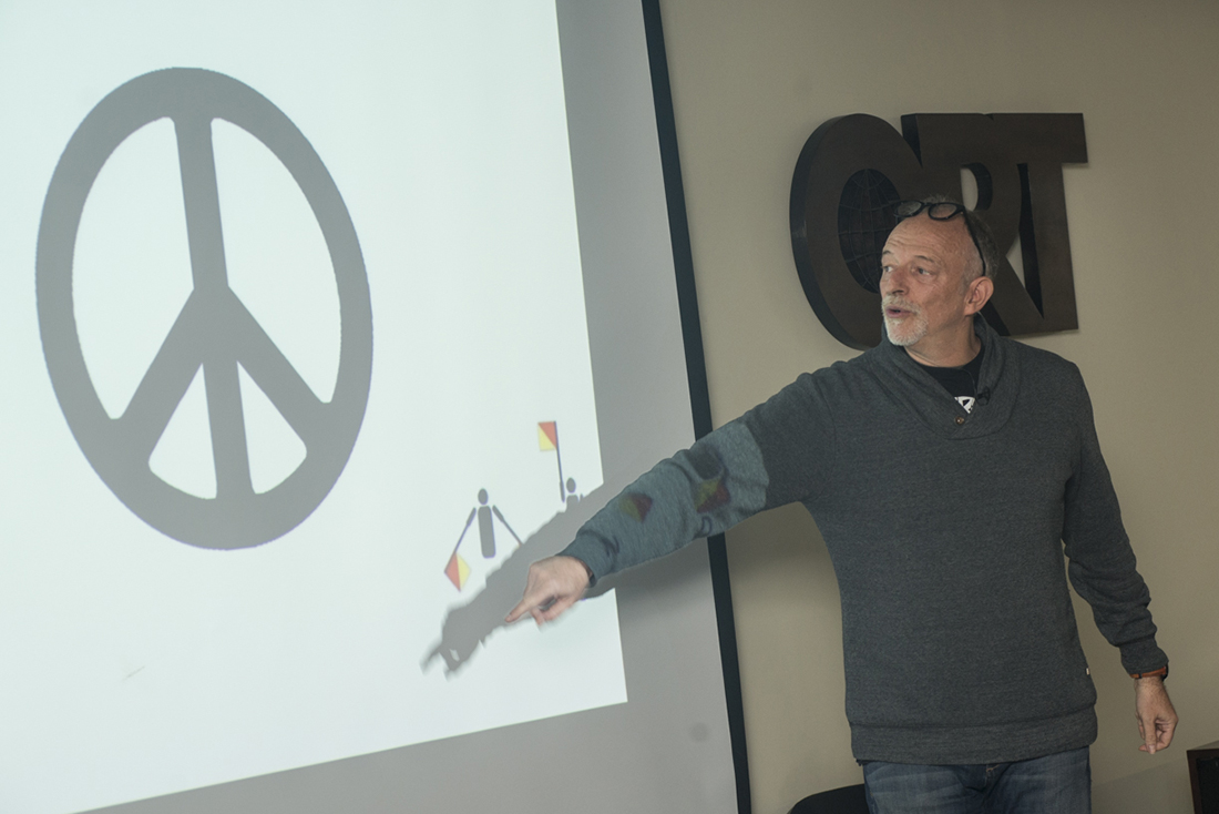
Starting with the Vitruvian Man, Vainesman went on to present various examples of logos grouped by their underlying geometric shapes. “Circles suggest community, integrity, and perfection. Squares convey stability and can also be used to imply balance.”
“The triangle, which appears in the sketches but has mysteriously disappeared from the Vitruvian Man, represents dynamism, tension, action, and direction,” he explained, citing world-renowned examples from all categories, as well as logos created using only lines, strokes, typefaces, and numbers.
Vainesman also emphasized the idea that neither a logo nor a symbol, corporate identity, or product is a brand (brand) in and of themselves. “The branding It's what you feel about a product, but it's not just about one person—it's when a group of people feel something about something that's when it really works. branding”, he clarified, referring to Marty Neumeier’s definition in his book The Brand Gap.
Returning to Havanna, he described them as “the alfajores that all Argentines living in the United States long for because they bring back fond memories.” That would be their branding.
In closing, the Argentine designer explained that logos sometimes change or are adapted to the circumstances of the moment.
“As many of you know, the woman icon has taken center stage,” he said, playing on words to refer to how Facebook redesigned its group and friend-adding icons by placing the woman in front of the man.
Another clear example, he added, occurred on June 26 of last year, when Supreme Court justices voted in favor of same-sex marriage in the United States.
“Major companies also showed their support, and it was an impressive day for the world of corporate identity because everyone who works with brands knows that no one is allowed to alter a brand’s Pantone color—and that was the only day when all the brands changed their colors,” he said, pointing to examples of brands such as Adobe, American Airlines, Coca-Cola, and Absolut Vodka, whose logos had been modified with colored stripes.
“Through this talk, I want you to realize that you don’t have to copy anyone else’s style—you have your own style, which you’ll begin to discover over the years. Always listen carefully to your teachers, even if you don’t entirely agree with them; they have many years of experience.”
“Listen to your peers as well, and have a lot of confidence in yourselves—otherwise you won’t get anywhere,” Vainesman concluded, citing himself as an example, since he became director of the Type Directors Club without ever having designed a typeface.